- 03
- December
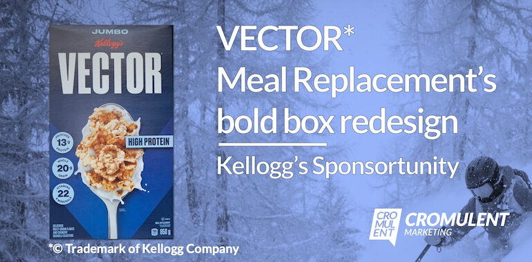
VECTOR Meal Replacement’s bold box redesign (Kellogg’s Sponsortunity!)
I know readers of this blog visit to learn about B2B marketing, particularly in the world of technology. But inspiration can come from anywhere and a recent development in the B2C landscape caught my eye—and my taste buds. I’m writing, of course, about the new box design for VECTOR* Meal Replacement.
*© Trademark of Kellogg Company
While obviously not all strategies and tactics translate from B2C to B2B, we can still borrow a few here and there. I mean, have you ever flipped through a car brochure and not found yourself admiring how it makes the features pop, how much breathing room there is in the layout, how it seamlessly transitions from lifestyle-oriented landscape shots to cross-sectional dissections of the latest engine and drivetrain technology? Contrast those sleek designs with the crammed-in and poorly messaged content in most B2B brochures and datasheets, and then try to tell me—with a straight face—that B2B can’t learn a thing or two.
But back to VECTOR Meal Replacement—and yes, “VECTOR Meal Replacement” is the official name, for official reasons (as we’ll see).
Bold styling for bold people
As both a marketing professional and an avid consumer (in the literal sense) of VECTOR Meal Replacement, I’m finely attuned to any change in the delicious product or its packaging.
So what a delight I received on a recent grocery run when I found myself face-to-spoon with a brand new VECTOR Meal Replacement box design.
The old box design did its job, getting VECTOR Meal Replacement into our hearts, minds, and stomachs. But the new box design is … I just feel like it’s finally worthy of the product within, y’know? It’s so clean, so clear, so tastefully straightforward. It just feels right.
Some of the changes are obvious, some are subtle, but each one is an upgrade. When you study every square centimetre of the box—and believe me, I have—you come to appreciate the attention to detail shown by the fine folks of Kellogg’s
The cover
Let’s start with the cover (English on one side, French on the other), because that’s what grabs your attention and doesn’t let go.
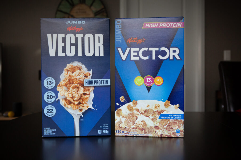
The first thing you notice (aside from the giant spoon overflowing with mouth-watering VECTOR Meal Replacement) is that, compared to the old design (right), the new design (left) is uncomplicated. And that’s terrific. Life’s complicated enough without needing to expend cognitive energy trying to decipher a meal replacement box.
We’ve gone from way too many colours (a bunch of blues, a bile green, some weird reddish-pink, and a disconcerting orange) and shapes (what’s up with that weird irregular quadrilateral that shows up twice?) to a restrained blue palette and friendly—familiar—circles and rectangles.
Let’s look at a few elements:
- The “JUMBO” label is now top-centre, instead of rotated and in the top-left. Good. I was tired of tilting my head over to make sure I was buying the minimum acceptable size of VECTOR Meal Replacement.
- The Kellogg’s logo is also centered, whereas before it was sorta floating a little to the left. Let’s keep politics out of this and stick to the centre, thank you very much.
- And now for the “VECTOR” text itself. In fact, I have so much to say about these six meaningful letters that I need a subsection…
The “VECTOR” Meal Replacement title
OK, now I feel like I can give the VECTOR title the attention deserves.
Let’s look (with chagrin) upon the old title:
- Squat (almost squared) font
- The letters are outlined because of the two-toned background
- There’s an integrated infinity sign hiding back there
And now let’s admire the new title:
- The lettering is tall and skinny, just like me. I can really relate to this font.
- The letters are what we in the business call “sharper”—they could cut you they’re so sharp, so be careful!
- And there’s no need for an outline, because the background is a solid field. The KISS principle at work!
The new box design also does away with the subtle infinity sign. Again, good! Infinity is a philosophical and mathematical concept usually attributed to the ancient Greeks. It reminds me of deep, scary thoughts and triggers an existential dread. Plus it triggers memories of calculus and my first university midterm (spoiler: did not go well).
Infinity has no place in living in the moment. Which is what I do. Especially when that moment is about enjoying VECTOR Meal Replacement.
OK, now let’s examine a few more design elements in detail.
The “HIGH PROTEIN” label
The old design had a complicated “HIGH PROTEIN” label up in the top-right corner. It wasn’t a rectangle, it wasn’t a parallelogram…I’m sure the math folks have a name for it, but I don’t know what that is.
(You know what? I did some research, and even the math folks don’t have a name for it. It’s just an “irregular quadrilateral.”)
Italic white text on that weird reddish-pink background, with the shape itself outlined by that bile green. I mean what the hell. WHAT THE HELL.
And now the new design. Again, so clean, so clear, so under control:
- Tall skinny font: again, I can relate
- No italics: no need for italics
- Dark blue on powder blue: a classic match
- A rectangle: familiar, reliable…no one ever sees a rectangle and becomes uncomfortable because they don’t know what it is
“But wait!” you exclaim. “The old box led with the ‘high protein’ message. Why move it?”
“Because,” I answer, “literally everyone knows VECTOR Meal Replacement is high in protein. That message was received loud and clear by the purchasing masses (credit to the old box), so there’s no need to artlessly shove it up in the top-right corner anymore.”
“Plus,” I continue, “The new ‘HIGH PROTEIN’ label literally overlays with that spoonful of enticing VECTOR Meal Replacement, further driving home the association.”
The nutrition call-outs
Don’t let its location in the cereal aisle fool you: VECTOR Meal Replacement is a meal replacement. And food producers can’t just slap that label on with disregard for our well-being. Nope. To be a “meal replacement,” food has to meet the Government of Canada’s high nutritional standards, which include:
- a minimum food energy value of 225 Calories per serving
- a specified amount and quality of protein
- a maximum amount of energy derived from fat (35 percent) and
- a specified amount of various vitamins and mineral nutrients
And the G of C is not messing around. It is literally prohibited to sell or advertise a meal replacement unless, when in a ready-to-serve form or when prepared according to the directions for use (with water, milk, partially skim milk or skim milk, or a combination thereof) it meets those requirements.
OK, with that lesson out of the way, let’s get back to discussing the nutritional benefits of VECTOR Meal Replacement.
The fine folks of Kellogg’s rightfully want to call out that VECTOR Meal Replacement is no mere cereal. After all, cereal is essentially just kibble for humans, while a meal replacement is “a formulated food that, by itself, can replace one or more daily meals.” (emphasis added)
The old box highlights VECTOR Meal Replacement’s 13g of protein, 20g of whole grains, and 22 vitamins and minerals (“per 55g serving of VECTOR with 200 mL of skim milk”) in the dead center of the cover, in what can only be described as a disaster of white-on-pastel ‘design’.
The new box simplifies things, switching instead to that wonderful (and much easier to read) combination of dark-blue-on-powder-blue and tastefully placing the circles down the left—again, visually associating with that salacious spoon.
You know what? Let’s look at that spoon in the detail it deserves.
The delicious VECTOR Meal Replacement itself
In the old box, the delicious VECTOR Meal Replacement product was confined to the bottom, shown in a bowl. By the time your eyes and brain have deciphered the top two-thirds of the box, you almost overlook the bowl. And why are some of the crunchy multigrain flakes and granola clusters seemingly leaping out? What agency do they have to decide and act? This image raises a moral quandary about consuming VECTOR Meal Replacement—I don’t want to deal with moral quandaries, especially on an empty stomach.
In the new box, the tasty product is now front-and-centre, and replicates what I see as I shove spoonful-after-spoonful of VECTOR into my gaping maw. And note that it’s “Enlarged to show texture”—and I’m glad it is. Just look at all those hearty multi-grain flakes and crunchy granola clusters behaving themselves as they look forward to entering my mouth. Such a beautiful arrangement, and everything on the spoon is so cooperative. Sure, it looks like the spoon was full of milk and then the VECTOR Meal Replacement was dropped on top; and sure, I don’t think anyone prepares the product in that manner—but that’s the only way to make sure the VECTOR Meal Replacement gets the design treatment it deserves.
The fine print
Continuing our journey down the cover of the box, we come to the fine print.
On the old box, this important information was…well it was just crappily designed (that’s the only way to put it). Because it floated over the bowl image, the fine print needed a white background and just really does not work for me.
Now, the new box…again, a thing of simplistic beauty with that oh-so-pleasing dark-blue-on-powder-blue text. The bottom-left reminds us that VECTOR Meal Replacement consists of “delicious multi-grain flakes and crunchy granola clusters” (more on this, later), while the bottom-right rightfully proudly displays the hard-earned “meal replacement” status.
Plus, we get other important information:
- That “U” in the circle? That means VECTOR Meal Replacement is a kosher pareve product
- We see that a single serving provides us with 289 important calories (which, as we’ll see, are intended to fuel our active lifestyle); interestingly, this caloric count represents an increase from the previous box’s 288, which I trace to a slight change in the recipe
- And whoa, 850g! Of course, you don’t need that information, because every bro knows that VECTOR Meal Replacement is one of the heaviest boxes in the aisle. You can incorporate it into your workouts instead of a medicine ball. Sure, a jumbo Quaker Harvest Crunch weighs almost twice as much, but <bleep> Quaker Harvest Crunch. Is it a meal replacement? Of course not. It’s also too sweet if you eat it in large quantities. Get outta here, QHC!
Now, keen-eyed observers might point out that the old box had a call-out saying, “No artificial flavours or colours,” and that this call-out is apparently absent from the new box. To them, I say “Who cares!” We all know that “artificial” is just a succinct way of saying “better than natural.”
Wow, OK…this concludes our examination of the cover.
Just kidding! We missed one of the most important elements…
That “V”
The old box design had a sky-blue, and very acute, V that extends for about two-thirds of the cover, in a desperate effort for attention (and sure, to direct the eyes to that low-texture image of the bowl).
The new box, in contrast, exudes self-confidence. More of a twilight blue—a darker blue, if you will, for the darker times in which we live. Less acute. Framing the spoon. And only extending for about half the box.
The old “V” begged for your dollars. The new “V” knows you’re going to buy VECTOR Meal Replacement and agrees with your decision.
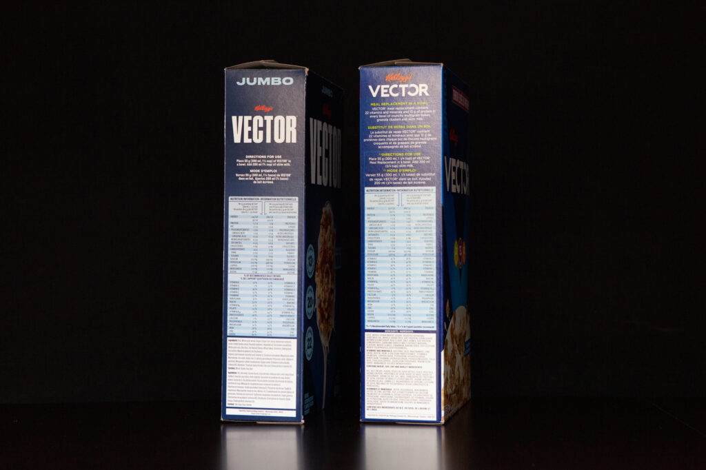
The spines
Let’s look now at the spines of the respective boxes.
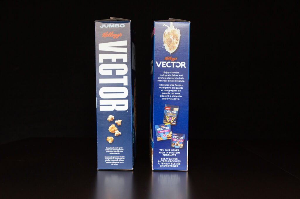
Once again, the redesign (left) dispels with convolution in favour of a bold simplicity (this box gets me).
What can we even say about the old spine (right)? There’s a spoon image, but it’s not nearly as nice as the one that adorns the new cover. And there are ads for other VECTOR products…looking at them with 2020’s eyes they just seem sad and desperate.
There’s also this text, “Enjoy crunchy multigrain flakes and granola clusters to help fuel your active lifestyle.” OK, not too bad…but can it be improved? As we’ll see, the answer is a resounding “yes.”
The new spine…I mean, wow. Just wow. Really take a moment to admire it. Perfect posture.
Plus, you could spot it in the dark, which comes in handy when you’re feeling snacky mealy in the middle of the night.
And the two hearty multi-grain flakes and three crunchy granola clusters that adorn the new box are just tempting your taste buds.
Which brings me to the text. The old text was fine. It was OK. And I guess if you’re the type of person who settles for “fine” or “OK” then that’s fine and OK—but if that’s the case, then VECTOR Meal Replacement probably isn’t for you.
The new text is unquestionably an upgrade: “Enjoy hearty multi-grain flakes and crunchy granola clusters to help fuel your active lifestyle.”
See how “crunchy” now modifies the granola clusters, and the flakes get their own new adjective—the delightfully satisfying “hearty”? I don’t know how many weeks or months it took to get that change approved, but it was worth it. “Hearty” is a universally positive word that conjures up images of meat and potatoes—you know, hearty fare.
But also notice what didn’t change: the critical “to help fuel your active lifestyle.” So let’s dive into that.
Fueling my active lifestyle
When I’m not running trails, cuttin’ chunks off my 5k time, riding single-track (artist’s rendering, below), or doing CrossFit—but not since March, I MISS IT SO MUCH—I’m eating VECTOR Meal Replacement. I’d climb, but I don’t live near mountains, I’d probably die, and climbies are a peculiar bunch.

And I have to assume that when you’re not back-country skiing, kite-surfing, or wakeboarding, you’re also consuming VECTOR Meal Replacement.
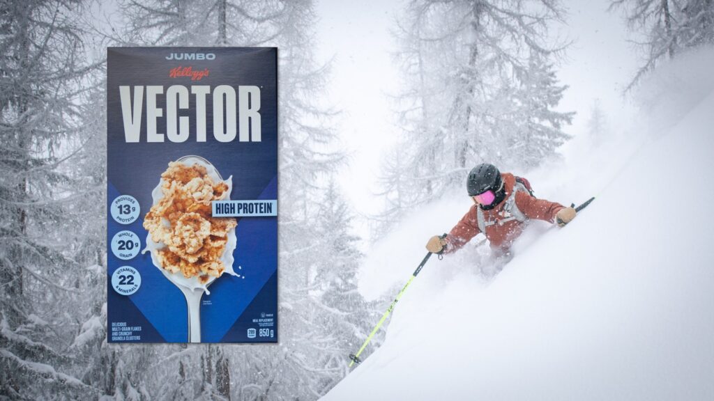
And you know why? Because VECTOR Meal Replacement is packed with what you need to help fuel your active lifestyle.
Now let’s look at the other spine, the ‘boring’ one the government and lawyers make Kellogg’s include.
First, the old one has way too many words. There’s just no time for that. I put down “The Narrow Corridor” because I wanted a break—and some VECTOR Meal Replacement—not to go and have to read something else.
Moving on…the Directions for Use haven’t changed. Yes, they’re still laughably optimistic in their restraint. I mean, who eats only 55g (1¼ cup) of VECTOR Meal Replacement? I just checked, and my average serving size is double that. Good—more protein, nutrients, and whole grains for me and my hella-active lifestyle.
A comparison of the two Nutrition Information boxes shows that despite the box redesign, VECTOR Meal Replacement still delivers the same great 22 vitamins and minerals (Sodium, Potassium, Copper, Manganese, Biotin, Vitamin A, Vitamin D, Vitamin E, Vitamin C, Thiamine, Riboflavin, Niacin, Vitamin B6, Folate, Vitamin B12, Pantothenate, Calcium, Phosphorus, Magnesium, Iron, Zinc, Iodide) and 13g of protein as it did before.
Of course, that’s with the accompanying serving of milk*. And sure, the product itself seems to have 0% B12, but now we’re just quibbling over nonsense.
*I serve my VECTOR Meal Replacement with a fortified soy beverage, because of the environmental impact and ethical issues of dairy farming
If we peek below the nutrition information, we find the Ingredients list. There are a few subtle changes here, but seemingly only with how things are grouped. Also, relax! The cinnamon is still there, which we can all agree is vital.
The bottom
Look, nothing important is on the bottom of the boxes, but let’s compare them anyway.
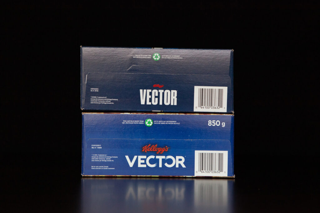
In another display of self-confidence, the new box shrinks the Kellogg’s logo and gives more breathing room to that wonderful new “VECTOR” lettering. I’m glad to see the box is still “made from 100% recycled paper fibres.”
The top
Like the bottom, the top is fairly unimportant, except for one detail (which we’ll get to). And like the bottom, the old vs new is another example of tasteful upgrades:
- The new “VECTOR” text stands confidently by itself
- The Kellogg’s contact information has been redesigned and reduced (because honestly, who needs the mailing address these days—I dropped the mailing address off my CV in 2005)
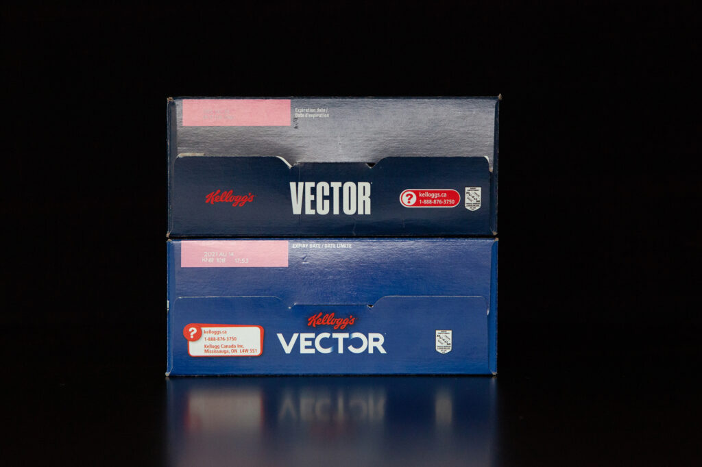
Now, what’s that one detail? The expiration date (or “expiry” date in the old design)! It’s still in white text on a weird mauve, but honestly this whole expiration date thing is laughable because NO BOX OF VECTOR MEAL REPLACEMENT HAS EVER FAILED TO BE CONSUMED (VORACIOUSLY) WELL IN ADVANCE OF PRODUCT EXPIRY.
What can we learn?
Look, we’ve all had some fun here, sharing laughs and thinking about how delicious and nutritious VECTOR Meal Replacement is.
But this is a business blog, so I want to make sure we take away some instructive lessons. So, what can we learn?
First, design makes a difference. Every aspect of your design influences—sometimes subtly, sometimes significantly—how your audiences think about your product, from the UI itself to the datasheets, brochures, web pages, social cards, advertisements, and other elements you employ.
I’m pained whenever I see a company with a good solution using clip art, lousy graphics, poor slide design, save-as-PDF datasheets or making any number of other horrible and completely avoidable errors. At best, your poor design makes it harder for your audience to spot and take in your messages; at worst, your poor design creates a terrible impression of your organization as unprofessional or your product as immature. This isn’t some cutesy little bootstrapping start-up thing that will endear you to potential clients, this is real life—first impressions are important and lasting. Pay a designer.
Second and third, know your audience and craft your messages accordingly. The marketing folks in the VECTOR division at Kellogg’s know that there’s a whole army of men in the 25-50 bracket who see VECTOR Meal Replacement as an efficient way to suck in things that we need to survive.
This ain’t no kiddy cereal, this is an adult’s meal replacement. It’s like Soylent, but not as pathetic and without the conspiracy nut co-founder.
Because Kellogg’s knows their buyers and consumers, they can focus their design on the things we want. That means they can emphasize the nutritional benefits to validate our addiction to their product, while also giving us credit for active lifestyles we may or may not lead.
VECTOR Meal Replacement boxes don’t need cutesy mascots or bright colours to manipulate children into bothering their already-just-hanging-on parents into buying it. In fact, chances are that VECTOR Meal Replacement isn’t even shelved at child-eye height.
Fourth, have a message hierarchy. A message hierarchy is a great tool because it helps you to focus your messages and improve retention. If you overwhelm your audience with too many messages, the real result is that they don’t remember any of them.
Kellogg’s knows what’s important enough to go on the cover and what can be safely relegated to the sides. Just like you need to know what should go above-the-scroll, or in the opening slides, or in the executive summary, and so on.
Finally, times change. What worked in the past might not work now. What was best in the past might not be best now. The old box design did its job and helped to establish VECTOR Meal Replacement in cupboards and pantries everywhere. But time marches on.
Maybe, after sitting down and enjoying a satisfying bowl of VECTOR Meal Replacement, ask yourself if your own company is clinging to ideas or designs from the past that just don’t work anymore—or maybe never worked in the first place. As the saying about the past goes, let go or be dragged.
—
Image credits: Mason Dahl and Alex Lange on Unsplash
VECTOR Meal Replacement photography courtesy of Victor Martello